Projects / SimplyProtein
ClientSimplyProtein
DisciplineArt DirectionBrandingPackaging
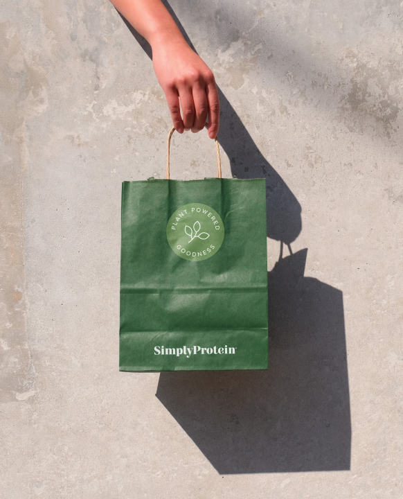
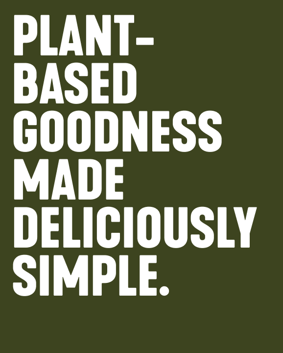
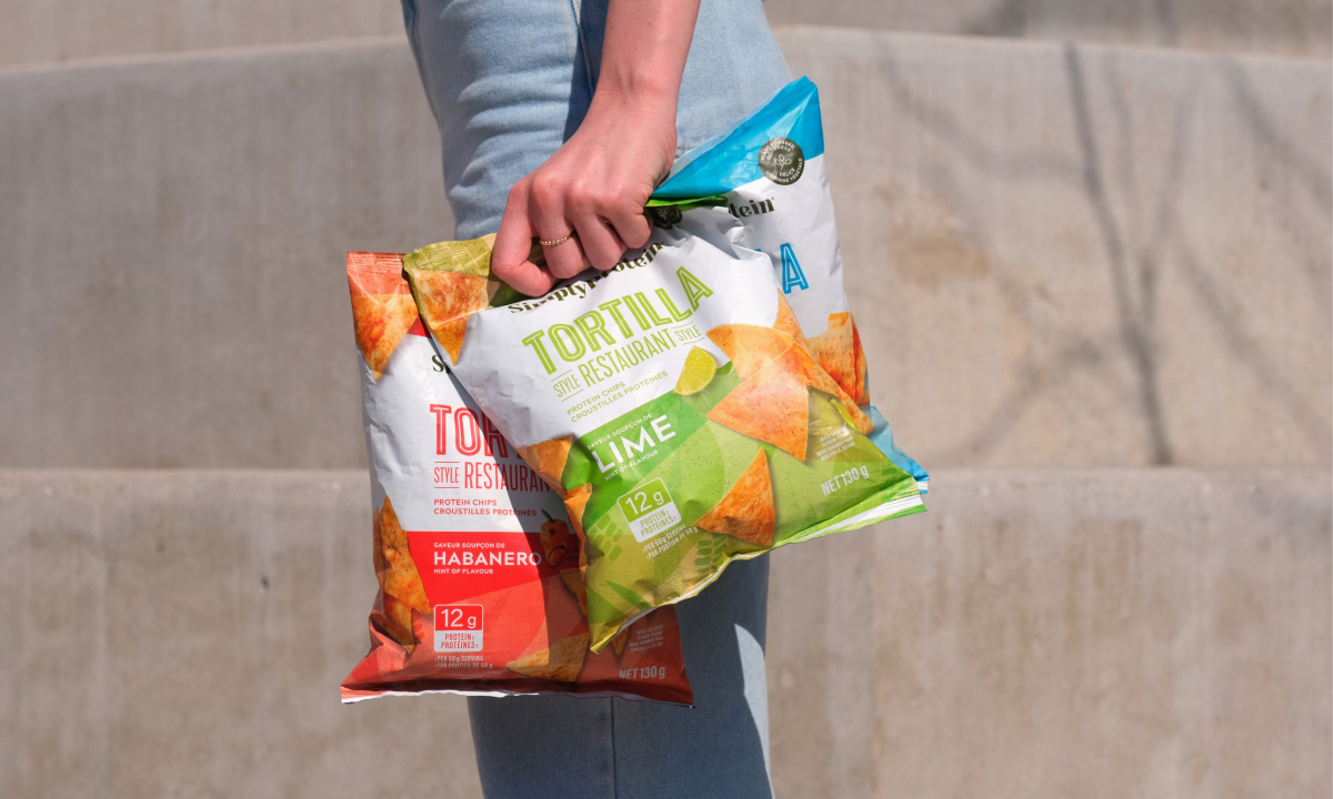
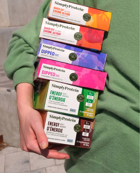
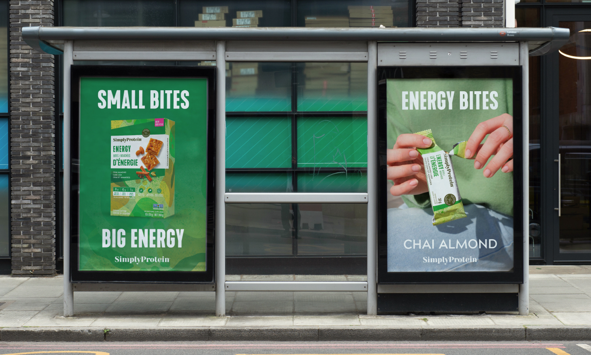
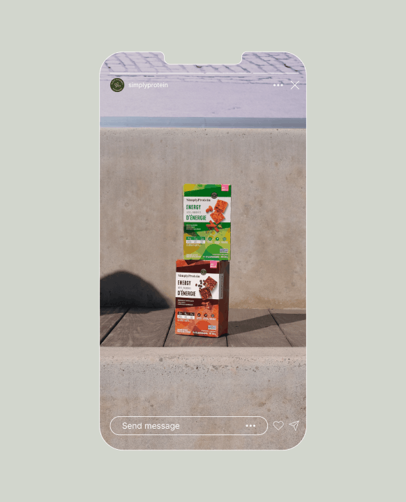
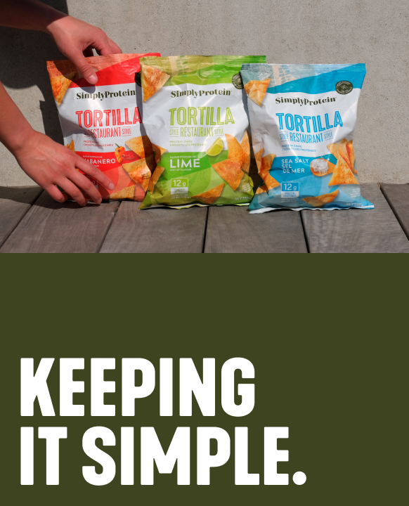
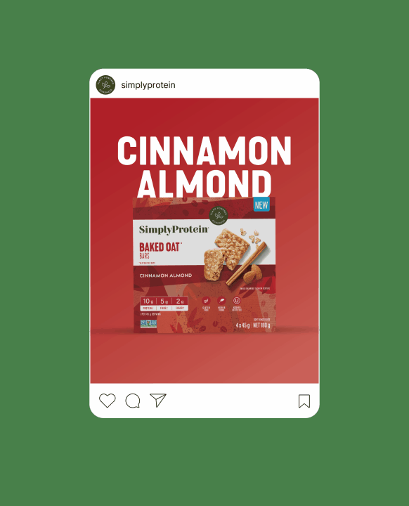
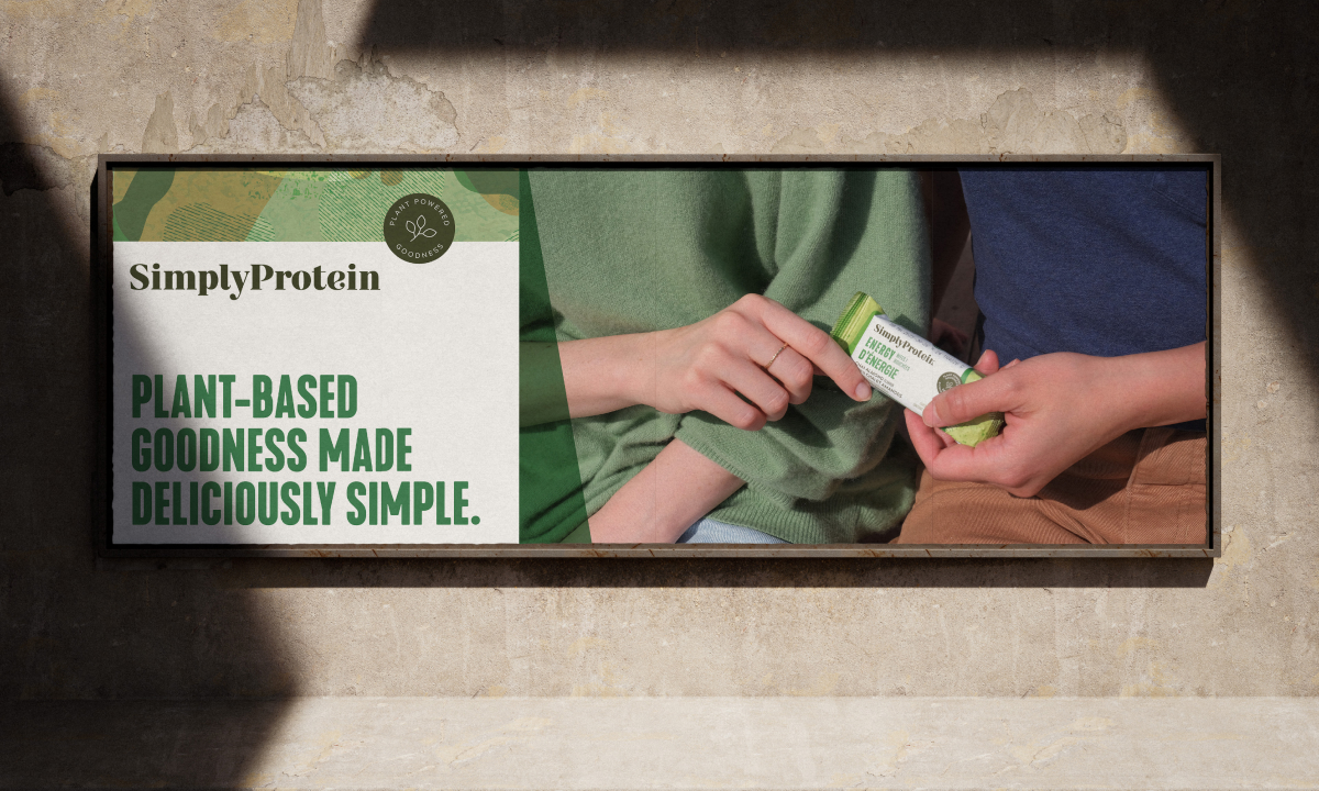
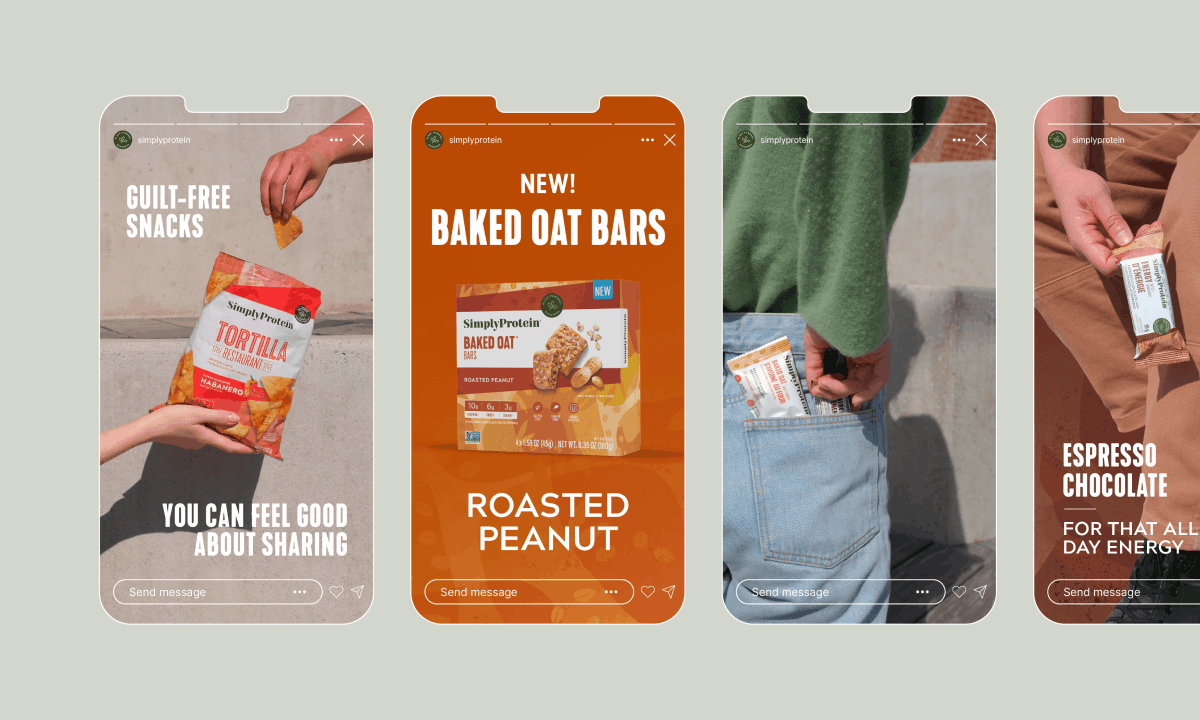
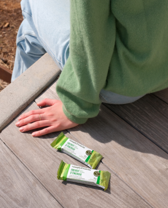
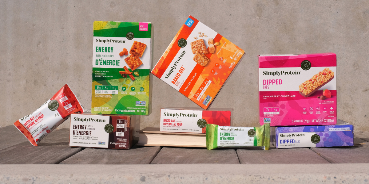
Great branding is no snack’cident. Introducing the newly rebranded Simply Protein, a leading Canadian plant-based snacking company known primarily for its high-protein snack bars. The team at Simply Protein came to A&M with a few problems. Consumers felt the brand was too clinical, and it was difficult to identify different product types and flavours. The prominence of key nutritional information was also recessed into the background making one of the key reasons to purchase difficult to find.
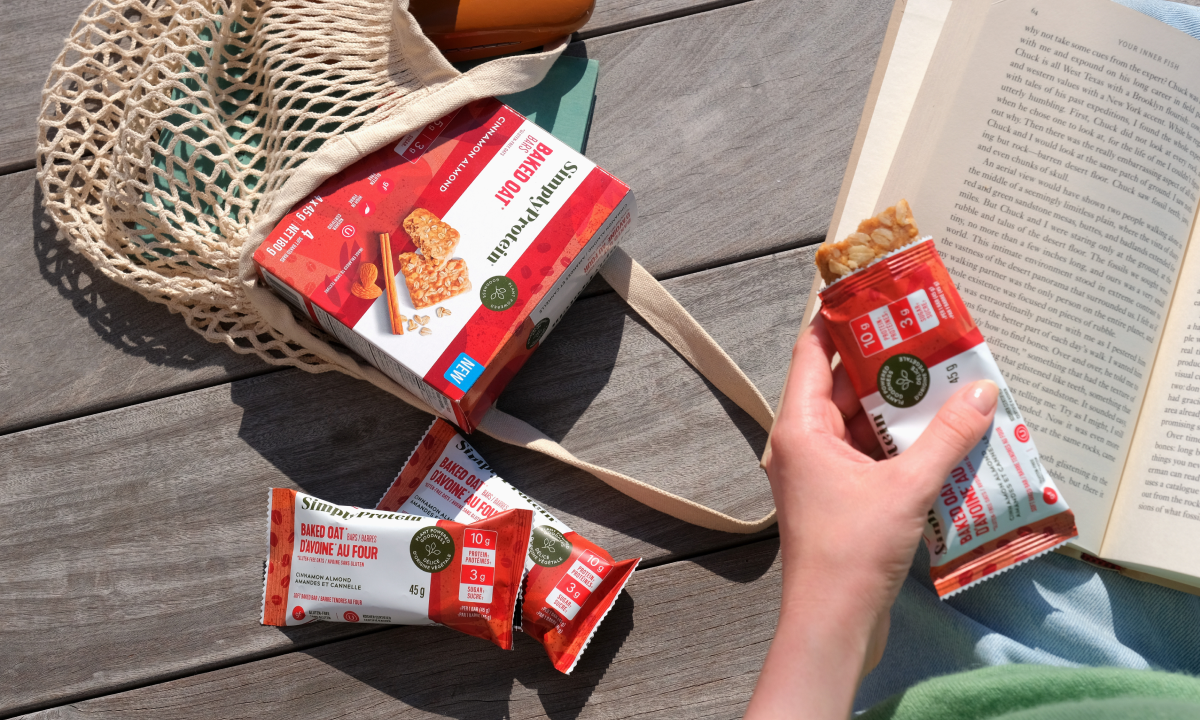
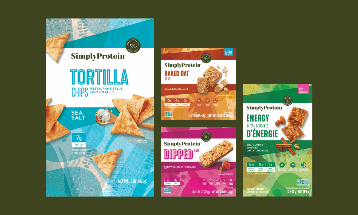
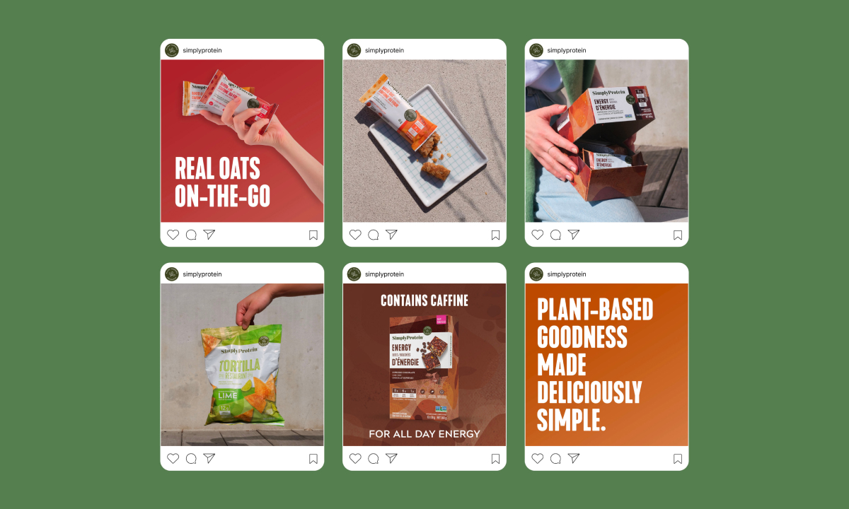
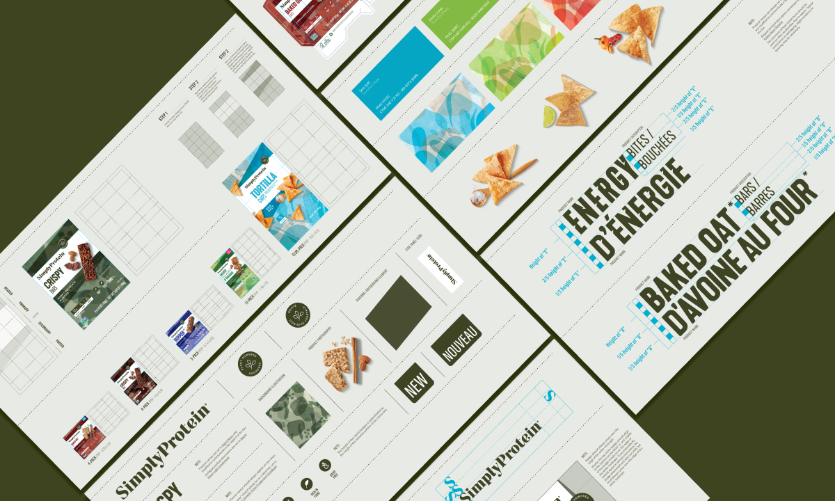
Creating systems that are successfully applied to a large number of skus is tricky business. Every change, be it creative or regulatory has an impact on how the system is defined and needs to be carefully assessed as to its impact on various formats and future innovation. Priority 1 was to solve issues limiting consumer engagement while also building consistency across all product platforms and formats to generate as much recognition and equity as possible. New illustrations based on the primary ingredient of each product, new type families inspired by the ingredients and textures of each product combined with flavor-based colour theory lead us to new brand elements and compositions that leveraged the white panels from the previous brand to create high contrast opportunities highlighting the most important information which you can see across. And like we said, highly engaging products, with incredibly complex systems that appear simple in execution, is no snack’cident. If you’re looking for more products from Simply Protein, you can find them here.