
Brand identity design is the visual language your business speaks to the world. It is every color, typeface, logo, and image that tells people who you are before you say a single word.
Done well, it builds trust instantly. Done poorly, it creates confusion that is very hard to undo.
Getting it right is not about spending more. It is about making intentional choices that reflect something true about your brand.
The Core Components of Visual Identity Design
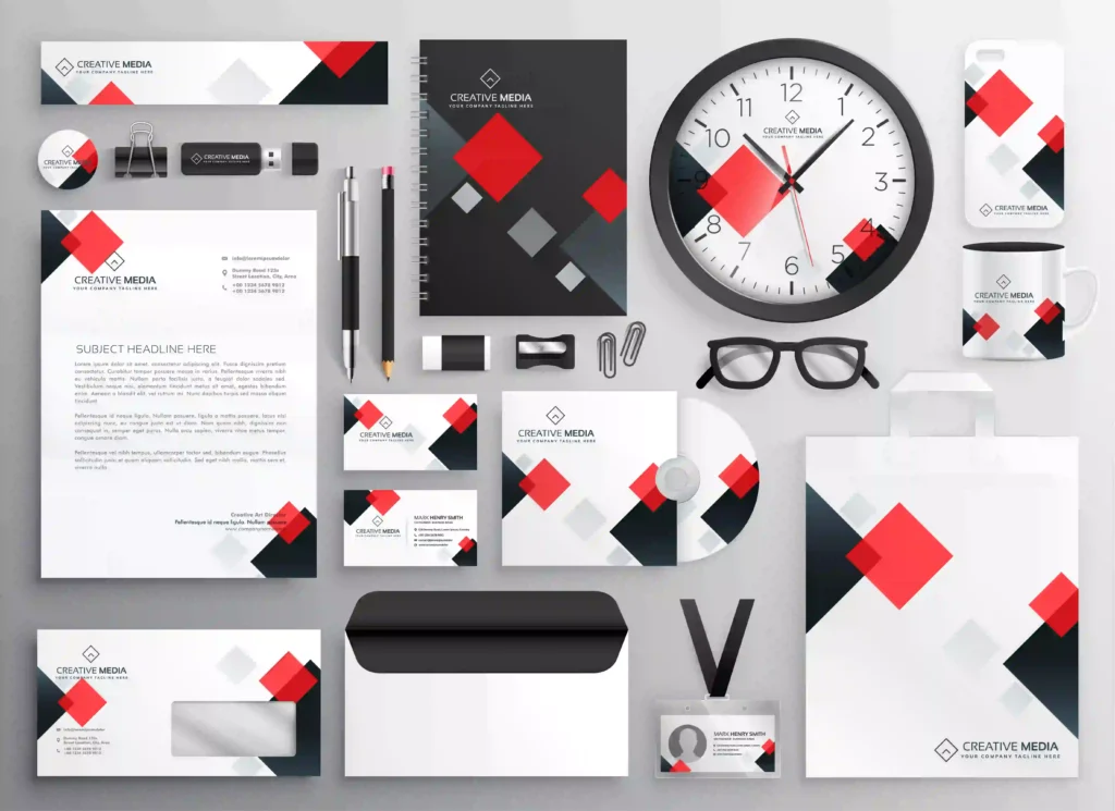
Visual identity design is not just a logo. It is a system of interconnected elements that work together to create a consistent impression across every touchpoint.
Logo
Your logo is the anchor of your visual identity. It appears everywhere: signage, digital platforms, packaging, and documents. Strong logo design principles prioritize simplicity, scalability, and meaning.
Color Palette
Colors carry emotional weight and trigger associations before a viewer reads a word. Your palette should reinforce what your brand stands for and stay consistent across all applications.
Typography
The typefaces you choose shape your brand’s personality. A geometric sans-serif reads as modern and clean. A classic serif reads as established and trustworthy. Pairing fonts correctly creates visual hierarchy and brand cohesion.
Supporting Imagery
Photography style, illustration choices, and icon sets are all part of your visual identity. They expand the palette and logo into a full visual world.
Why Consistency in Graphic Design Matters
Consistency is not about being boring. It is about being recognizable.
Every time someone sees your brand, they are building a mental model of who you are. Inconsistent visuals fracture that model and erode trust. Consistent visuals reinforce it, quietly and powerfully.

Branding vs Marketing: Understanding the Difference
This distinction trips up a lot of people. Branding and marketing are related, but they are not the same.
Branding is who you are. It is the identity, the values, the visual system, and the tone of voice that exists at the core of your business.
Marketing is what you do with that identity to reach an audience. Campaigns, ads, and promotions are all marketing. They are only as strong as the brand underneath them.
When you know the difference between branding vs marketing, you make smarter decisions about where to invest your time and resources.
Key Graphic Design Principles Applied to Brand Identity
Hierarchy
Visual hierarchy guides the viewer’s eye in the right order. In brand materials, this means leading with what matters most.
Contrast
Contrast creates distinction and draws attention. High contrast between brand elements makes your visuals more memorable and readable.
Alignment
Alignment creates order and professionalism. Consistent alignment across brand materials signals attention to detail.
Repetition
Repeating visual elements, such as a specific color or typeface, reinforces brand recognition across every medium.
Balance
Balance makes your designs feel stable. Whether you use symmetrical or asymmetrical balance, it should feel intentional and not accidental.